
Thirteen drinks, two sizes, one question
Three ranges with different prices per size, from ₱45 to ₱75. Presented badly, a customer has to message the business to learn what a drink costs — and most will not bother.
Commercial website project · Philippines
A drinks brand that existed everywhere except on a website of its own.
Lemon Refresh sells lemon-based drinks from five stalls — four company-operated across Dipolog City and one run by a franchisee in Rizal, all five within Zamboanga del Norte. The business was already trading, already running events, already taking franchise interest. Its only web presence was a Facebook page.
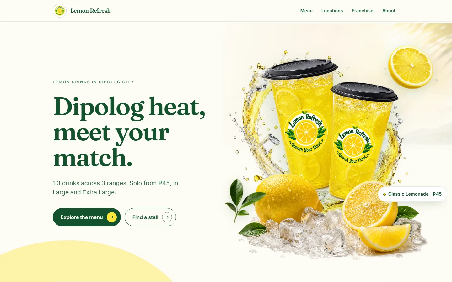
I directed the strategy, information architecture, UI/UX and build of its first website: a menu you can read without asking anyone, stall detail precise enough to walk to, and a franchise page that answers with the footprint that exists rather than a forecast.
Creative direction, site strategy, information architecture, UI/UX and content decisions. I directed and shipped the production website through UX, QA and deployment.
A real five-stall business with no website — and source material carrying claims that could not be verified enough to publish.
Built a nine-page site around three customer jobs: read the menu, find the right stall, ask about a franchise. Then made the unverifiable claims impossible to ship.
A live production site whose menu, locations and community content are rendered from typed data files, protected by 143 automated tests and a build that fails on a banned claim.
Context
Lemon Refresh operates five stalls: Lee Plaza 1st floor, Lee Plaza 3rd floor, Foodhub Boulevard Building A and Building B — all in Dipolog City — plus one franchise-operated stall in Rizal, Zamboanga del Norte. Thirteen drinks across three ranges, each in two sizes.
None of that was findable. A customer wanting to know what a drink costs had to message the business. Someone standing in Lee Plaza had no way to know there were two Lemon Refresh stalls in that building, on different floors. And a competitor's unclaimed Google listing was ranking for the brand name in its own home city.
The challenge
Three ranges with different prices per size, from ₱45 to ₱75. Presented badly, a customer has to message the business to learn what a drink costs — and most will not bother.
Two stalls sit inside Lee Plaza on different floors. Two more sit in separate buildings at Foodhub Boulevard. Naming the mall sends a customer to the wrong counter.
Someone checking a price and someone considering a franchise want completely different things. Serving the second badly turns the homepage into a pitch deck.
The strongest-sounding lines in the existing material were unverifiable, legally exposed, or contradicted by the business's own documents. Deciding what to leave out was the real work.
That last one shaped everything else. A recipe manual that could not be quoted. A franchise agreement naming a real individual. A pairing offer whose arithmetic did not support the promise on the label. Each was attractive copy, and each had to go.
Which floor matters
Most small-business sites put the address in the footer. That works when there is one address. Here, two stalls share a building and differ only by floor, and two more sit in separate buildings on the same boulevard with different opening hours.
So the locations page leads with the ambiguity instead of hiding it. Its heading is “5 stalls, and which floor matters”, and every stall carries its building, its floor and its own hours.
Street addresses are deliberately absent. A competitor's unclaimed Google listing trades under the Lemon Refresh name from a different address in the same city; publishing a street number the business cannot yet defend would have added to that confusion rather than resolving it. Building, floor and a maps link get a customer there without the risk.
The franchise page
Franchise pages in this category tend to lead with income potential. This one cannot — no verified financial data exists, and publishing a forecast would be both unevidenced and legally exposed. So the page says so in its first line, and then offers the one thing that is verifiable: the footprint that exists today.
The inquiry itself is set out as three steps — you send the form, we reply with the detail, you decide — and costs are answered in the reply rather than published, so the figure a prospect receives is the current one. It is a smaller promise than the category makes, and a keepable one.
Brand & build
The visual system is deep green and lemon yellow, editorial rather than playful, and price-forward — a calm frame around a bright product. Yellow never carries text: at 1.27:1 against white it fails contrast by a wide margin, so it is a surface and an underline, never a label.
The homepage hero is a composited product scene assembled from supplied layers rather than one flattened image, so each element holds its own depth and entrance and any layer can be swapped without a re-export. It is the only route that loads an animation library; every other page ships none.
Media was excluded on evidence, not taste. Two Coin Winner photographs carried a third-party copyright watermark. One event photograph was excluded because a promotional banner was legible in the frame — the build blocks that claim in text, and an image would have walked straight past the check. Several assets branded the business under a different spelling and were held back as an open question rather than quietly published.
Verification
The highest risk on this project was never a layout. It was publishing a claim the business could not stand behind. A note in a document does not prevent that. A build that refuses to complete does.
A guardrail scanner runs over both the source and the rendered HTML with seventeen rules covering retired claims, the unresolved pairing label, income and health claims, blocked assets and the closed branch. It is itself tested with positive controls, so a rule that stopped working would be caught rather than assumed.
Verified by running the project's own suite against the current codebase on
2 September 2026: npm test — 143 tests across 9 files, all passing.
npm run check — 67 files, 0 errors, 0 warnings, 0 hints; guardrails
clean across 57 source files. npm run build — 9 pages, guardrails clean
across 23 rendered files. npm run links — 315 references, no broken
internal links or fragments.
The site publishes a sitemap of seven pages, a robots.txt that allows crawling and
points at it, self-referencing canonicals, and Open Graph and Twitter metadata per
page. Six of the seven pages carry Organization schema; five of the six inner pages add a
breadcrumb trail, and the menu is marked up as a schema.org Menu with a
section per range and a priced offer per size, in Philippine pesos.
The size wording rule reaches into that markup too: offers read Large and Extra Large, because structured data is customer-facing metadata that surfaces in search results.
The figures above are build and test results from the project's own tooling, run on the date stated and reproducible by anyone with the repository. They say the site builds clean and holds its contracts. They say nothing about how it performs for visitors.
The site launched recently. I have no verified data on traffic, search rankings, orders, delivery volume or franchise inquiries, and no meaningful before-and-after baseline exists, so I make no claim about any of them — and I have deliberately not run a page-speed test purely to have a number to show. If evidenced data becomes available, it will be added here.
What this demonstrates
A version of this site that simply looked good was always available. It would have carried the preparation claim, headlined the pairing offer, published the street address, and put an income figure on the franchise page. Every one of those would have read stronger in the short term and been indefensible the first time someone checked.
What is there instead is narrower and true: a menu that answers the price question, stall detail that gets someone to the right counter, and a franchise page that trades a forecast for a footprint. That is the same judgement a client is buying when they hire someone to speak for their business in public.